Use geom_rect() to add recession bars to your time series plots #rstats #ggplot

Zach Mayer’s work reproducing John Hussman’s Recession Warning Composite prompted me to dig this trick out of my (Evernote) notebook.

First, let’s grab some data to plot using the very handy getSymbols() function from Jeffrey Ryan’s quantmod package. We’ll load the U.S. unemployment rate (UNRATE) from the St. Loius Fed’s Federal Reserve Economic Data (src="FRED") and load the time series into a data.frame:

unrate = getSymbols('UNRATE',src='FRED', auto.assign=F) 
unrate.df = data.frame(date=time(unrate), coredata(unrate) )

Now FRED provides a USREC time series which we could use to draw the recessions. It’s a bit awkward, though, as it contains a boolean to flag recession months since January 1921. All we really want are the start and end dates of each recession. Fortunately, the St. Louis Fed publishes just such a table on their web site. (See the answer to “What dates are used for the US recession bars in FRED graphs?” on http://research.stlouisfed.org/fred2/help-faq/.) Sometimes it’s still easier to cut-and-paste (and the static table covers another 64 years, go figure):

recessions.df = read.table(textConnection(
"Peak, Trough
1857-06-01, 1858-12-01
1860-10-01, 1861-06-01
1865-04-01, 1867-12-01
1869-06-01, 1870-12-01
1873-10-01, 1879-03-01
1882-03-01, 1885-05-01
1887-03-01, 1888-04-01
1890-07-01, 1891-05-01
1893-01-01, 1894-06-01
1895-12-01, 1897-06-01
1899-06-01, 1900-12-01
1902-09-01, 1904-08-01
1907-05-01, 1908-06-01
1910-01-01, 1912-01-01
1913-01-01, 1914-12-01
1918-08-01, 1919-03-01
1920-01-01, 1921-07-01
1923-05-01, 1924-07-01
1926-10-01, 1927-11-01
1929-08-01, 1933-03-01
1937-05-01, 1938-06-01
1945-02-01, 1945-10-01
1948-11-01, 1949-10-01
1953-07-01, 1954-05-01
1957-08-01, 1958-04-01
1960-04-01, 1961-02-01
1969-12-01, 1970-11-01
1973-11-01, 1975-03-01
1980-01-01, 1980-07-01
1981-07-01, 1982-11-01
1990-07-01, 1991-03-01
2001-03-01, 2001-11-01
2007-12-01, 2009-06-01"), sep=',',
colClasses=c('Date', 'Date'), header=TRUE)

Now the only “gotcha” is that our recession data start long before our unemployment data, so let’s trim it to match:

recessions.trim = subset(recessions.df, Peak >= min(unrate.df$date) )

Finally, we use ggplot2’s geom_line() layer to draw the unemployment data and transparent (alpha=0.2) pink rectangles to overlay the recessions:

g = ggplot(unrate.df) + geom_line(aes(x=date, y=UNRATE)) + theme_bw()
g = g + geom_rect(data=recessions.trim, aes(xmin=Peak, xmax=Trough, ymin=-Inf, ymax=+Inf), fill='pink', alpha=0.2)

One-liners which make me love R: Make your data dance (Hans Rosling style) with googleVis #rstats

It may be a cliché, but much of R’s utility comes from its amazing community. And by community, I am specifically referring to the bright, hard-working people who are willing to share their knowledge and code with the rest of us. Because of their contributions, we can do some amazingly cool and useful things with very little code of our own. It is in this context that I launch this new series to highlight packages and functions which make it easy to do jaw-droppingly cool and useful things.

First up: the googleVis package by Markus Gesmann and Diego de Castillo which makes it easy — often with just one-line of R — to harness the Google Visualization API. Annotated timelines, gauges, maps, org charts, tree maps, and more are suddenly at your command.

I’m going to focus on the motion chart, popularized by Hans Rosling in his groundbreaking 2006 TED talk on global economic development. (If you haven’t seen it yet, you should. Right now. Seriously. Go.) Motion charts are an innovative way to display multidimensional time series in an interactive way. And the googleVis package even comes with some sample data to make it even easier to try them out.

The package is available from CRAN if you need to install it.

To get started, load the package and the included “Fruits” data.frame:

library(googleVis)
data(Fruits)

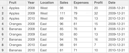
This data.frame contains some sample data about sales of various fruits at different locations for different years. There’s even a proper Date column already constructed for us from the numeric Year column:

To make the chart, we need to give the gvisMotionChart() function our data.frame and tell it a few things about it: the column which identifies the items to examine (idvar=Fruit), the time dimension (timevar=Date), and optionally a name to use to identify the chart in the generated HTML and JavaScript (we’ll use chartid="ILoveFruits"):

M = gvisMotionChart(data=Fruits, idvar="Fruit", timevar="Date", chartid="ILoveFruit")

That’s it.

You can view your chart with the overridden plot() function. It will automatically spawn a browser window and serve up your chart through R’s internal web server:

plot(M)

Since WordPress doesn’t allow embedded JavaScript, please click through to see the motion chart in action:

You can also access all 165 lines of the generated HTML and JavaScript and save it to disk:

cat(unlist(M$html), file="output/ILoveFruits.html")

Time suck alert: googleVis may make them easy to create, but motion charts can be a lot of fun to play with. You have been warned…

If you want to take a look at an example with some real data, you might be interested in the 20 Years of the U.S. Domestic Airline Market In 20 seconds post on my work blog.

Finally, here are the slides from my lightning talk on this topic at this month’s Greater Boston useR Group meeting:

Have fun!

googleVis-0.2.4 requires older version of RJSONIO (0.5-0) #rstats

[Update: the new release of googleVis accounts for changes in RJSONIO’s handling of backslashes, so you probably won’t need the older version.]

Something has apparently changed in the way RJSON’s toJSON() function works which is causing all sorts of extra escape characters (backslashes) to appear in the googleVis-generated JavaScript, at least when trying to set a visualization’s initial state. This bogus code causes the browser’s JavaScript engine to choke just before it can call chart.draw(), so you don’t see the Flash visualization at all–just a blank space with the pretty footer.

This is at least the case on Mac OS 10.6.7 and Markus Gesmann gets all the credit for tracking it down.

Here’s an example state string which selects a couple of bubbles to be labeled (“Oranges” and “Apples”) and sets the time to start about half-way through:

state.json='{"xAxisOption":"3","xZoomedDataMin":81,"playDuration":15000,"sizeOption":"_UNISIZE","xZoomedDataMax":111,"xLambda":1,"dimensions":{"iconDimensions":["dim0"]},"yZoomedDataMax":91,"duration":{"multiplier":1,"timeUnit":"Y"},"orderedByX":false,"xZoomedIn":false,"yZoomedDataMin":71,"showTrails":false,"orderedByY":false,"iconType":"BUBBLE","uniColorForNonSelected":false,"yZoomedIn":false,"nonSelectedAlpha":0.4,"yLambda":1,"time":"2010","yAxisOption":"4","iconKeySettings":[{"LabelY":27,"key":{"dim0":"Apples"},"LabelX":42}],"colorOption":"6"}'

# create the motion chart
M=gvisMotionChart(Fruits, "Fruit", "Year", options=list(state=state.json))

Here’s the output in question using the current RJSONIO 0.7:

> cat(M$html$chart['jsDrawChart'])

// jsDrawChart
function drawChartMotionChartID6db280db() {
  var data = gvisDataMotionChartID6db280db()
  var chart = new google.visualization.MotionChart(
   document.getElementById('MotionChartID6db280db')
  );
  var options ={};
options["width"] = [    600 ];
options["height"] = [    500 ];
options["state"] = [ "{\\"xAxisOption\\":\\"3\\",\\"xZoomedDataMin\\":81,\\"playDuration\\":15000,\\"sizeOption\\":\\"_UNISIZE\\",\\"xZoomedDataMax\\":111,\\"xLambda\\":1,\\"dimensions\\":{\\"iconDimensions\\":[\\"dim0\\"]},\\"yZoomedDataMax\\":91,\\"duration\\":{\\"multiplier\\":1,\\"timeUnit\\":\\"Y\\"},\\"orderedByX\\":false,\\"xZoomedIn\\":false,\\"yZoomedDataMin\\":71,\\"showTrails\\":false,\\"orderedByY\\":false,\\"iconType\\":\\"BUBBLE\\",\\"uniColorForNonSelected\\":false,\\"yZoomedIn\\":false,\\"nonSelectedAlpha\\":0.4,\\"yLambda\\":1,\\"time\\":\\"2010\\",\\"yAxisOption\\":\\"4\\",\\"iconKeySettings\\":[{\\"LabelY\\":27,\\"key\\":{\\"dim0\\":\\"Apples\\"},\\"LabelX\\":42}],\\"colorOption\\":\\"6\\"}" ];
  chart.draw(data,options);
}

And here’s working code from RJSONIO 0.5:

> cat(M$html$chart['jsDrawChart'])

// jsDrawChart
function drawChartMotionChartID47a55df7() {
  var data = gvisDataMotionChartID47a55df7()
  var chart = new google.visualization.MotionChart(
   document.getElementById('MotionChartID47a55df7')
  );
  var options ={};
options["width"] =    600;
options["height"] =    500;
options["state"] = "{\"sizeOption\":\"5\",\"nonSelectedAlpha\":0.4,\"xLambda\":1,\"iconType\":\"BUBBLE\",\"yZoomedDataMax\":91,\"iconKeySettings\":[{\"LabelY\":-124,\"LabelX\":-160,\"key\":{\"dim0\":\"Oranges\"}},{\"LabelY\":53,\"LabelX\":37,\"key\":{\"dim0\":\"Apples\"}}],\"xZoomedIn\":false,\"orderedByX\":false,\"showTrails\":false,\"yZoomedIn\":false,\"yZoomedDataMin\":71,\"xZoomedDataMin\":81,\"orderedByY\":false,\"xAxisOption\":\"3\",\"yAxisOption\":\"4\",\"uniColorForNonSelected\":false,\"duration\":{\"timeUnit\":\"Y\",\"multiplier\":1},\"time\":\"2009\",\"yLambda\":1,\"xZoomedDataMax\":111,\"dimensions\":{\"iconDimensions\":[\"dim0\"]},\"colorOption\":\"2\",\"playDuration\":15000}";
  chart.draw(data,options);
}

Maybe this post can help others avoid the blank look I had on my face as I kept staring at a blank page in my browser.