My recent post Nightlights: cool data, bad geocoding highlighted some of the geocoding challenges Steve Mosher has been finding as he works with this interesting “light pollution” data set.
It was also my first article reposted on Tal Galili’s fantastic R-Bloggers site which I have been following for a while. But even better than the surge of new visitors were the great comments and suggestions posted by members of the community. In this post, I’m going to walk through each suggestion to illustrate just how generous and helpful this community can be.
Our starting point is where we ended up in my first post, using ggplot2 to display the raster nightlights data and map overlay:
library(RCurl)
library(R.utils)
library(rgdal)
library(raster)

url_radianceCalibrated = "ftp://ftp.ngdc.noaa.gov/DMSP/web_data/x_rad_cal/rad_cal.tar"
calibratedLights = "rad_cal.tar"
hiResTif = "world_avg.tif"

download.file(url_radianceCalibrated,calibratedLights,mode="wb")
untar(calibratedLights)
gunzip( paste(hiResTif, '.gz', sep='') )

hiResLights = raster( hiResTif )

# Eastern Mass., Cape Cod & Islands:
e = extent(-71.5, -69.5, 41, 43)

r = crop(hiResLights,e)
p = rasterToPoints(r)
df = data.frame(p)
colnames(df) = c("lon", "lat", "dn")

g = ggplot( data=df) + geom_point(aes(x=lon, y=lat, color=dn) )
g = g + scale_colour_gradient(low="black", high="white", trans="sqrt")
g = g + theme_bw() + xlim(c(-71.5,-69.5)) + ylim(c(41,43))
g = g + opts( axis.text.x = theme_blank(), axis.text.y = theme_blank() )
g = g + borders("state", colour="yellow", alpha=0.5)
Note the mismatch between the data and map overlay and the weirdness in the map where points are missing on the North Shore:
Ben Bolker suggested a way to eliminate the artifacts which led me to this discussion on R-sig-Geo between Hadley Wickham and Paul Hiemstra which tipped me off to the existence of geom_path layer in addition to the geom_polygon layer which borders() usually produces. Polygons are closed but paths need not be, so that helps. And ggplot2’s map_data() function seems to grab the same data as borders():
b = map_data("state")

g = ggplot( data=df) + geom_point(aes(x=lon, y=lat, color=dn) )
g = g + scale_colour_gradient(low="black", high="white", trans="sqrt")
g = g + theme_bw() + xlim(c(-71.5,-69.5)) + ylim(c(41,43))
g = g + opts( axis.text.x = theme_blank(), axis.text.y = theme_blank() )
g = g + geom_path(data=b, aes(x=long,y=lat,group=group), colour="yellow", alpha=0.5)
Bonus: geom_path() obeys the “alpha=0.5” directive to set the transparency:
But Robert Hijmans really hit it out the park with two great suggestions. First, he pointed me towards a much, much better source of coastline data by using raster’s getData() function to grab data from the GADM database of Global Administrative Areas:
usa = getData('GADM', country="USA", level=0)
Level 0 will get you country boundaries, Level 1 for state/province, and so on. So we’ll lose state boundaries, but these files are pretty big to start with and can take a lot longer to plot.
Also, be warned: apparently somebody sinned against The Church of GNU, so you may need to run gpclibPermit() manually before running fortify() on the SpatialPolygonsDataFrame:
> f_usa = fortify(usa)
Using GADMID to define regions.

	Note: polygon geometry computations in maptools
 	depend on the package gpclib, which has a
 	restricted licence. It is disabled by default;
 	to enable gpclib, type gpclibPermit()

Checking rgeos availability as gpclib substitute:
FALSE
Error: isTRUE(gpclibPermitStatus()) is not TRUE
> gpclibPermit()
[1] TRUE
With that hoop cleared, we can fortify() and plot this new layer:
f_usa = fortify(usa)

g = ggplot( data=df) + geom_point(aes(x=lon, y=lat, color=dn) )
g = g + scale_colour_gradient(low="black", high="white", trans="sqrt")
g = g + theme_bw() + xlim(c(-71.5,-69.5)) + ylim(c(41,43))
g = g + opts( axis.text.x = theme_blank(), axis.text.y = theme_blank() )
g = g + geom_path(data=f_usa, aes(x=long,y=lat,group=group), colour="yellow", alpha=0.5)
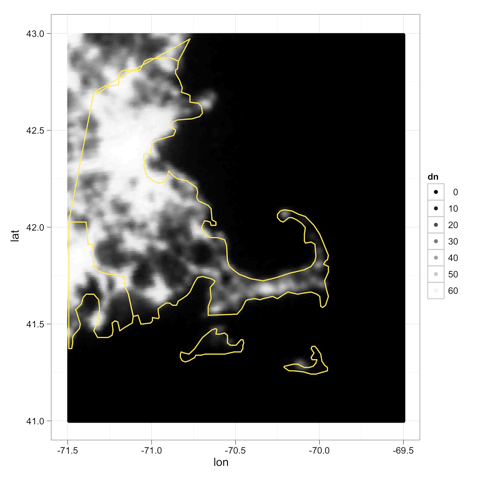
The coordinates are still shifted, but—wow—what a beautiful coast line. Cape Ann on the North Shore is really there now:
Robert also points out an important mismatch in that GDAL returns the top left corner and resolution, so we could be off by a pixel or so. A quick call to xmax() and ymax() will fix this in our original raster:
xmax(hiResLights) = 180
ymin(hiResLights) = -90

r = crop(hiResLights,e)
p = rasterToPoints(r)
df = data.frame(p)
colnames(df) = c("lon", "lat", "dn")

g = ggplot( data=df) + geom_point(aes(x=lon, y=lat, color=dn) )
g = g + scale_colour_gradient(low="black", high="white", trans="sqrt")
g = g + theme_bw() + xlim(c(-71.5,-69.5)) + ylim(c(41,43))
g = g + opts( axis.text.x = theme_blank(), axis.text.y = theme_blank() )
g = g + geom_path(data=f_usa, aes(x=long,y=lat,group=group), colour="yellow", alpha=0.5)
Hey, that’s not bad at all:
Looking at the final version leads me to wonder how much of the geocoding problem is position, and how much is resolution/blurring/smearing. The lights of Provincetown, for instance, look pretty good. Maybe the blob is too north by a few pixels, but at least it’s well contained by land now. On Nantucket, the blur is half in the harbor. Then again, on Nantucket, most of the lights are right on the harbor, from the ferry terminal and running east to main street. So the lights are just about where they should be. Perhaps they’re just blurred and therefore spill into the harbor?
But the real point of the post is to highlight the generosity of this community. For that, thanks. And again: welcome R-Bloggers readers!


